I recently was able to activate the upcoming new Facebook “Timeline” view on my account and thought it’d be useful to do a simple walk through explaining the differences (for good or ill). This won’t be going live for a few weeks, but I have the run down on the goods. It basically it breaks down into 5 parts – The Cover, Views, Activity Log, Stories, & Ticker. So read up so you’ll know what’s what when it finally goes live.
(7/28/11 UPDATE: I’ve also now added what public users & friends see once they go to your page! Now section #6 – What the Public can see & #7 What your Friends can see)
For those that want the “official” look at what Facebook is up-to, they’ve released a pretty clean-looking over at facebook.com/about/timeline.
 #1 – The Cover
Your cover is a huge picture that everyone will see the first thing. This takes the idea a lot of people have done with “combining” multiple pictures to create a banner. here, your picture is your banner. Your identify. Choose a unique photo to feature on your cover and change it as often as you like. You may notice that the image is locked into a very widescreen view. Luckily once you’ve added the photo, you can drag it around to get it showing exactly what you want.
 #2 – Views
This is where you’ll find your info, photos, likes, apps and other stuff — all in one central place. It’s located directly under the large cover picture. Think of this as the old “Info” page on the old layout.
 #3 – Activity Log
 This part isn’t public, it’s just for you to see. Your activity log lists all your posts and activity, from today back to the beginning. Personally I think this is one of the two big things in the new set up. Instead of going to multiple pages to manage what can and can’t interact with your life on Facebook, this page allows you to with a single click (more info in a bit). Anything that you’ve every authorize to post, shows up here. It gives a very good view of what you are posting, as well as what you’ve allowed to post for you, in one view.
To choose, select the arrow along side it. From there you can:
- Make it a feature item, allow or hide it from the TimeLine
- Choose who can see it: public (everyone), friends or certain groups you’ve set up
- Delete it from your history
- You can choose to exclude entire apps from your TimeLine, remove them from Facebook entirely, or report the application as spam or something offensive.
All in all, a very visual and straight forward way of looking at your history, without having to go through multiple screens for every different items. This page will show all posts, whether from apps, pictures, friends… If it was ever posted to Facebook and involved you… it’s there.
 #4 – Stories
Here is the bulk of the page. The stories section is your timeline. Everything you normally would see on your homepage, shows up here. Clicking in the upper right hand corner of each post brings you to the edit features that we are used to (remove, block, etc). Scroll back to the beginning or jump to a specific time by clicking the dates along the right side of your timeline.

Once you get out of the “recent” items it starts doing some filtering. At this point instead of having a long list of posts, it tries to figure out what post of that month were most important. This is very similar (if not exactly the same) as to what Facebook rolled out earlier this month. I’m guessing it uses clicks, interactions, likes, and who knows what else to figure this out. It tries to keep the amount of content it seems to a minimum.
 However you’re not limited to just seeing those “important” items. Clicking the “…” give you the option to “show all stories” from that month.
 In the upper right corner where you can set permissions, there is a new “star” and old “pencil” buttons. Clicking the pencil icon will also allow you to edit, or completely remove the post. Clicking this will expand the post (as seen below) to cover both sides of the column. Doing so makes the post stand out among its non-star’d brethren.

I’m assuming (but can’t tell since it’s not live yet) that anything you “star” will factor into other people’s threads as more important, and therefore more likely to show up in their view.

#5 – Ticker
Although this isn’t “new”, it’s still pretty recent. At least recent enough for them to point it out while going over the new design, so I figure I will too. Ticker takes a lot of the “extra” stuff that’s been floating in your main page, and pushes it off to the side. This includes post that you will see in your Story view, but also smaller things like what songs are playing, or game scores, or game requests… all that annoying stuff you often block. It’s constantly moving so you can pay attention to it or not. Either way it’ll keep changing and updating as you move along.

#6 – What the Public can see
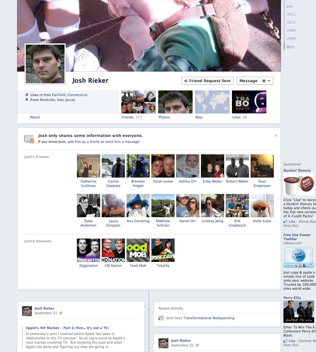
For the most part the Public view is what you would expect. Your profile picture and feature picture are viewable as well as some basic info about you. All posts, pictures, movies, links, etc down below that you’ve marked public are viewable. The main difference is that it adds all the items that people used to seeing along the side, now in its own box above the Story section. This includes your public interests, friends, and a link to add as friend or send a message. You can also close that frame if you wish.
 #7 – What your Friends can see
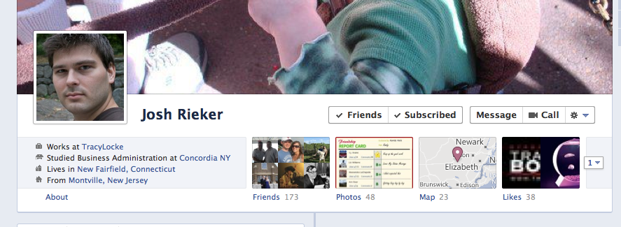
For friends this “public” section is greatly reduced, and looks a lot more like your own view of the info page. Your friends, photos, checkins, etc are all group in the info page. If there are any mutual friends it will display a number in the friends section. Friends get an additional buttons up top that allow to show if you’ve friended them or are subscribed, or both (you don’t have to be friends with someone just because they are friends with you in this new Facebook). There are also buttons to message or send a video call (which Facebook introduced not too long ago using Skype)
UPDATE #2 – I seemed to have missed the Life Event feature of the Timeline. I’ve did a separate post about this. Enjoy.
What do you think of the new lay out? Please leave your thoughts or anything you’d like me to test out in the comments.


I like the new layout – and like “timeline” in general. I see lots of potential for creating really cool cover pics (i.e., designers could create a portfolio type image with a “hire me” type campaign).
What I am not sure I understand yet is the “view”. I uploaded a cover pic (nothing fancy, just playing around) and at first “view” the pic is really large – but when I click off my timeline and back to it, the pic is notably smaller in height…..
The view same as the old sidebar for your info. Pages, photos, likes, all the things that don’t warrant their own full section on the front page, but are easily categorized. You can expand it, but it will recollapse to a single line when you leave.
But perhaps i’m misunderstanding since the view area doesn’t really have a picture. There are only two pictures on your time line that you set. One is the cover pic (which you seem to have a handle on), and your old style “profile” pic. That image doesn’t get larger, it stays the same small size.